Additional Tools
The Market Oracle toolkit is a richly packed toolkit containing other assistive features. These are all listed and documented below:
Dynamic Reactor
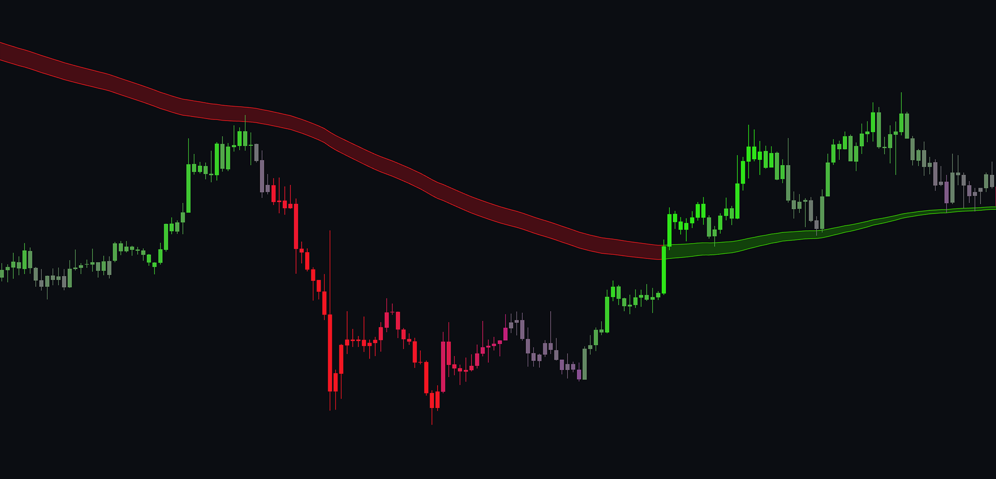
The Dynamic Reactor displays a simple band across the chart, helping identify support and resistance levels while indicating trend direction with green and red colors. By applying unique adaptive calculations to a moving average, this plot exhibits distinctive and responsive behavior.
 |
|---|
| The Dynamic Reactor showing trend identification |
This band can be seen as the market's center point, acting like a magnet. The further the price moves from this area, the stronger the pull back toward it.
See how to adjust the reactor below:
If the price is above the Reactor, the market is in an uptrend; if below, it’s in a downtrend. This tool is excellent for confluence-based trading. For instance, if a trend signal indicates a buy and the price is above the Reactor, the likelihood of success increases as both suggest an uptrend.
Volume Flex Reactor
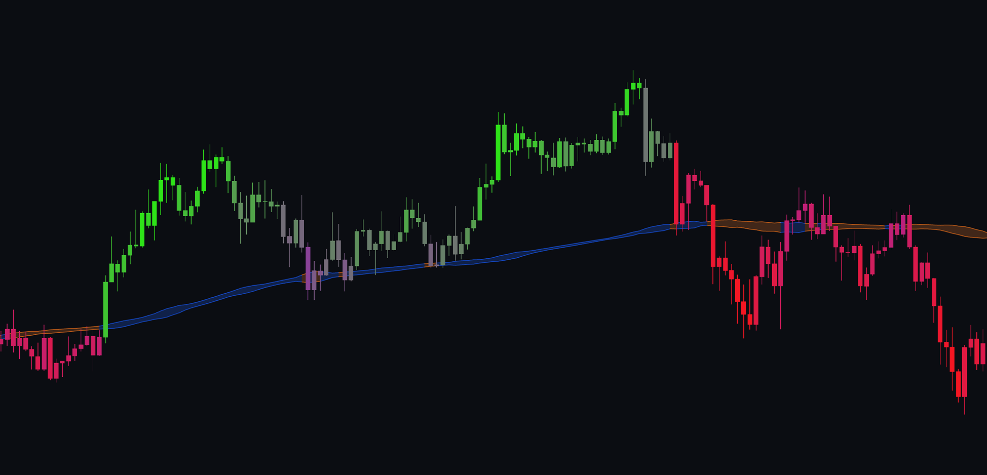
The Volume Flex Reactor operates similarly to the Dynamic Reactor but focuses on volume analysis. It expands during periods of high volatility, serving as a reliable support and resistance level by considering relevant volume zones before plotting.
 |
|---|
| The Volume Reactor showing trend identification and its support and resistance capabilities |
The Prime Trend Assistant
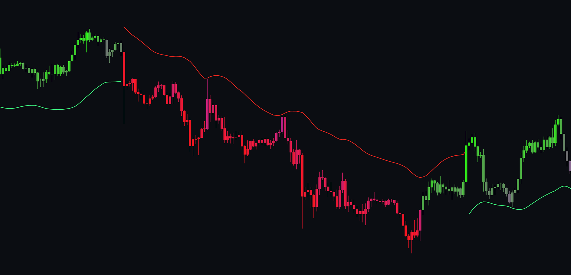
The Prime Trend Assistant provides dynamic support and resistance levels that follow trends, making it ideal for use in confluence with other indicators. On the chart, you'll see a green line for an uptrend and a red line for a downtrend.
 |
|---|
| Trend Assistant guiding price action |
This feature functions as a trailing stop, allowing for dynamic stop-loss adjustments while in a trade.
The price can bounce off these lines, acting as support or resistance.
This indicator is also a highly responsive trend-following tool that works well in conjunction with other trend indicators.
Momentum Wave Bands
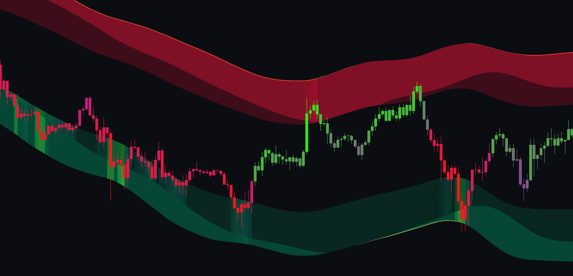
The Momentum Wave Bands identify potential reversal areas by analyzing market momentum and noise, similar to Bollinger Bands. When the price enters these zones, a reversal is likely, making this tool effective when paired with other reversal indicators.
 |
|---|
| Momentum Wave Bands showing Support and Resistance levels |
The zones are highlighted in green or red to indicate the trend's direction.
The bands consist of inner and outer zones, with the outer zone presenting a statistically higher likelihood of price reversals due to greater deviation.
Candlestick Structures
Candlestick Structures analyze candlestick formations, enhancing classical patterns by filtering through market activity. They excel at identifying reversals, especially in conjunction with other techniques like support/resistance confluence. For example, if the price is at resistance and a bearish candlestick pattern forms.
Supported patterns include:
EG - Engulfing Patterns: The body of the candle completely eclipses the previous one.
Hammer: A reversal candlestick with a long wick, resembling a hammer.
RTM - Rising Three Methods: This candlestick pattern arises during an upward trend and returns to the same path in the following days. It's a bullish continuation pattern, indicating that the market is in a strong buy-side period, and the trend will likely continue in the foreseeable future.
FTM - Falling Three Methods: This pattern is characterized by two long candlesticks in the direction of the trend—one at the beginning and one at the end—with three shorter counter-trend candlesticks in the middle. The falling three methods pattern shows traders that the bulls still lack sufficient conviction to reverse the trend.
Bullish Soldier & Bearish Soldier: A reversal pattern that consists of three consecutive long-bodied candlesticks that open within the previous candle's real body and close that exceeds the previous candle's high.
Evening Star & Morning Star: A reversal pattern consisting of three candles: a large bullish candlestick, a small-bodied candle, and a bearish candle.
Prime Ranges
The Prime Ranges are volume-weighted support and resistance levels that also serve a trend-following purpose. Note that the asset must have volume data on TradingView for this feature to function. These lines indicate areas with significant volume where price reactions may occur. The colors of the ranges also signify the macro trend: green for an uptrend and red for a downtrend.
VWAP Channel
The VWAP Channel tool identifies swing highs and lows, plotting VWAP bands from these points to highlight potential mean reversion zones.
Key Features: VWAP Bands: Plots upper and lower VWAP bands from swing high and low points. Sell Signals: ▼ triangles appear when the price reverts back into the channel from above the upper VWAP band. Buy Signals: ▲ triangles appear when the price reverts back into the channel from below the lower VWAP band. Mean Reversion Alerts: ⬥ diamond signals indicate price interaction with the VWAP bands, signaling potential buy/sell or mean reversion opportunities. Price Labels: Labels at swing points and VWAP start points display the price at those levels. Adjustable Settings: Users can modify channel width, calculation length, and enable/disable warning signals. Warning Feature: ⚠️ symbol warns traders when upper or lower bands are about to reset to new starting points, advising caution in such areas.
Usage: This tool is ideal for traders using mean reversion strategies, identifying price extremes, and reacting to price retracements toward VWAP channels. The warning feature helps avoid trades during band recalibrations, improving decision-making around dynamic price zones.
The ChartPrime Dashboard
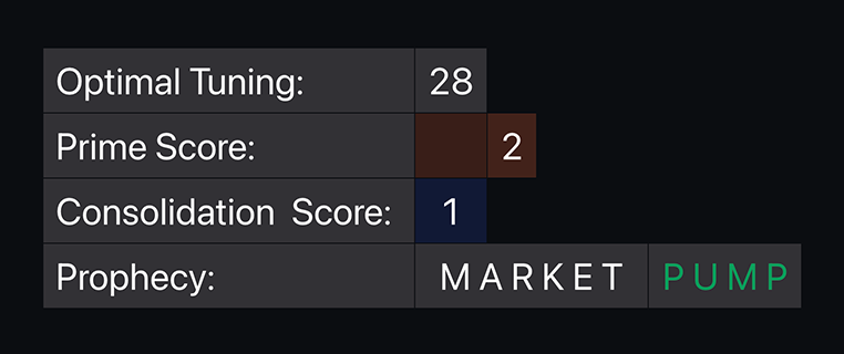
The ChartPrime Dashboard aims to provide market insights at a glance, comprising three main items (when enabled in settings):
- Optimal Tuning: Offers optimal settings based on 500 bars of data to help users clean chart signals quickly and tune them for specific timeframes and assets.
- Prime Score: Generates a score from 1-10 to indicate market sentiment, with 1 being extremely bearish and 10 extremely bullish, providing quick insights into market conditions.
- Consolidation Score: Measures how much the market is ranging on a scale of 1-10, helping determine optimal trading strategies or if it's best to avoid trading altogether.
- Prophecy: Predicts potential market movements, indicating either pumps or dumps based on various criteria and algorithms, serving as a predictive assistant for confluence.
 |
|---|
| The Dashboard |
Measuring a ranging market can be tricky. You only know a market is ranging once it starts to range. Use this feature assistively.
Users can change the size and location of the dashboard in the settings.